Tuesday 31 January 2017

Death- Connecting essay 5

Photographer- Brooke Di Donato


My Image


The image by Brooke Di Donato is interesting to me because of the way that the artist leaves the subjects face obscured only showing her hands this is intriguing to the viewer as it creates an element of mystery.  The central positioning of the subject in the image immediately draws the viewers eye towards the flowers and subject in the image.  The flowers present in the image as well as the pink tones featured throughout provide create an air of femininity in the image something which is particularly interesting as the setting of the image is a living room which is historically a female dominated area.  The mid shot camera positing of the image is interesting to me as it allows for more setting to be visible in the image whilst the shallow depth of field allows for the flowers to remain in the images centre.  The muted colour scheme creates a sombre and serious air in the image, the addition of blues in the image adds to this effect.

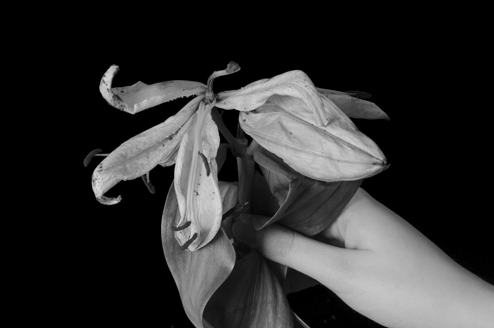
In my image I choose to incorporate the muted tones of Di Donato's image in order to convey the sombre nature of my series which focused on incorporating the historic symbolism of a lily being linked to death imagery throughout language.  I have also chosen to incorporate the shallow depth of field in order to draw the majority of the viewers focus to the Lily.  The lily I have used in this shoot was largely decayed and I choose to use this in order to create a greater emotive effect and better translate the concept that a Lily symbolises death.  I choose to use a navy blue backdrop and also a place the Lily against the subjects purple jumper as beige and muted purple are contrasting colours this makes the Lily stand out further from the subject.  I have also chosen to keep the theme of the subjects face being obscured in order to create an element of mystery and anonymity.  I chose to alter the framing of the image however kept the Lily in a central position with a close shot of the subjects torso.

If I were to revisit this shoot I would consider making the lighting more even and possibly experimenting with various other kinds of flowers that relate to different emotions.  I feel that whilst I could have used a standard camera lens that the use of a macro lens provided an additional level of detail in the image.

In conclusion I feel that that this shoot was largely successful with the coloration and positioning used creating a striking image.

Death- Straight images

This image is a photo joiner composed of numerous images of different sizes in order to create the larger and final image.  The image was shot in a  studio with two soft boxes and a tripod in order to prevent camera shake this equipment set up as well as the use of a macro camera was used in every image from this shoot.  Both this image and the one below were edited in photoshop to reduce their saturation creating muted tones, contrast was also increased and curves were altered to create a more striking image.  I chose to use a dark blue background in order to prevent the image from appearing overly dark whilst still maintaining the dark and sombre imagery associated with lily's.  


This image features a shallow depth of field focused around the dead lily in the images centre with a subjects torso and the backdrop out of focus.  The image uses overall dull muted tones in the image this helps to maintain the sombre imagery associated with white lilies.  The fact that the subjects head is not visible in the image gives the image an air on anonymity and mystery which intrigues the viewer as well as reminding them that death and loss could happen to anyone.


This image was created by increasing the images contrast but decreasing it's saturation and altering the colour levels present individually.  This creates a crisp image with a deep range of tone and shadows whilst drawing the viewers eye directly to the lily in the subjects hand due to the strong contrast of colour between the light subject and dark image background. This image was shot with a macro lens allowing for a great deal of detail to be captured in the image.


Tuesday 24 January 2017

Computer and Print Experiments


Text overlay and erasion 


Process:
  1. Alter image as you wish e.g. brightness, contrast, lighting.
  2. Crop image to desired dimensions such as 1x1 framing as shown above.
  3. Create a text box and write chosen text such a "BITE THE BULLET" across the images top and resize until the text evenly fills the top of the image.
  4. Open a new blank image and then drag the text into it.
  5. Drag the copied text out of the blank document and onto your original image you should now have to lines of text.
  6. Repeat until you have filled the image with text.
  7. Ensure that your chosen text colour stands out well against the colour of your subject in the image.
  8. Select the eraser tool (a large tool can be used for bigger areas but it is best to use a smaller rubber when going round the edges of your subject) and erase text that is not placed on your images subject.


Saturation alteration with grid composition


Process
  1. Crop the image to your desired dimensions such as 1x1 as seen above.
  2. Use the quick select tool to select the area you wish to alter the colour of (if the smaller/easier to circle area is not the area you wish to alter the colour of you can select it and then inverse the selection to create the same effect).
  3. Toggle the saturation option in adjustments to alter your image.
  4. Save this image as a jpeg file and repeat multiple times with colour variants.
  5. Once you have however many colour variants that you wish for reopen your files.
  6. The create a new blank document.
  7. Drag your edited images onto this document and resize them to suit your needs (above I decreased their size and overlaid them to make sure they had the same dimensions) before placing them in your desired formation.


Joiner


  1. Open 40cmx40cm white layer.
  2. Insert images taken on shoot.
  3. Create composition of images by altering sizes of various images and creating a layered placement.
  4. Adjust images saturation, brightness and contrast as needed.
  5. Crop image as desired.


Filter gallery stained glass


  1. Open image.
  2. Open filter gallery.
  3. Select stained glass.
  4. Alter light intensity, cell size and border thickness until you are satisfied.
Text


  1. Edit image as you wish (above image is edited with a reduced saturation and lowered brightness as well as curves).
  2. Insert text using text tool.
  3. Edit text size, coloration and positioning.


Black and White


  1. Open image.
  2. Crop as wished.
  3. Alter saturation using adjustment layers.
  4. Alter brightness using adjustment layers.
  5. Alter lightness using adjustment layers.
  6. Alter contrast using adjustment layers.
  7. Alternatively alter each colours saturation individually using the saturation tool.
Layered Saturation


  1. Create 40cmx40cm white square background.
  2. Open the image you wish to use in a separate tab.
  3. Drag selected image into white square.
  4. Repeat as many times as desired (four layers are used above).
  5. Evenly shift layers to create a staggered or step like effect.
  6. Reduce opacity of layers 2,3 and 4 in order to create semi-transparent layers (opacity approximately 40).
  7. Alter layers saturation in order to create an interesting composition add new saturation layers between each layer of image.
  8. Crop white background around edited image to create a 2x6 composition.


Friday 20 January 2017

Love- Work Diary

Basic information:
Date: 19/01/17
Camera used: Nikon D3500
Props or subject: Prop
Editing program: Photoshop CC 2014
Camera settings: 1/125, f/5, ISO 3200

Technique used: Home lighting
Camera set up: Shot on location

Favourite image


This is my favourite image from this shoot due to the way that the petals have been positioned to form a heart as this displays the romantic connotations of a rose.  I also like the way that the lighting has created subtle shadows around the exterior of the image which draws the viewers eye to the lighter spot at the images centre and the roses around it.  The shallow depth of field used here achieved through the high aperture of f5 allows the petals to be in varying degrees of focus further drawing the viewers eye to the centre of the image where the main point of focus is present.  I feel that the low saturation of the image gives the image a nostalgic feel creating an appearance similar to a scrapbook.

Least favourite image


This is my least favourite image as I feel that it has colder colours than the other images in the series which gives it a less nostalgic appearance than the other images in the series.  I also dislike the empty space present in the images centre as the viewers eye is drawn there opposed to towards the ring box in the images left third.  Despite these factors however I still like this image and think that it works well in the series.


Thursday 19 January 2017

Love- Straight images


This image was shot at my house opposed to in the studio meaning that I had to be careful with the lighting used to prevent it from becoming overly orange in appearance as a result of tungsten bulbs.  I worked out a couple of possible locations to shoot and found that the white marble appearance of the counter top gave the best contrast to the ring in the box and the rose used.  I choose to position the single rose next to the open ring box as these objects are both symbols of love which is what I wanted to convey in this shoot.  I used a shallow depth of field in this shoot as I wished to draw the viewers eye towards the subjects of the image this is also achieved through the close range which I shot at and the contest between the countertop and the objects that are the images subject.  When editing the images in this series I choose to lower the images saturation in order to give them a nostalgic appearance as well as increasing the images lightness and brightness but being careful not to augment the petal structure in this process.


In this image I have placed the ring box in the left hand third of the image this allows the viewers eye to be drawn to the ring box invoking the idea of love.  This is further enforces the link between roses and petals as a being symbolic of love.  My least favourite element of this image is the fact that the rose petals appear to be somewhat symmetrical in placement however the fact that the petals are all in varying shapes and sizes as they are natural objects symmetry is further broken here by the shallow depth of field which pulls focus to particular areas of the image.


The extreme close up combined with the shallow depth of field used in this shot draws the viewers eye to focus mainly on the petal that sits in the images centre.  I like the way that the petals in this image appear to fall randomly as this alludes to the chaos of love and emotions.  I feel that it would have also been interesting to capture a similar image using a wide depth of field and would look to explore this concept in future projects.


I choose to make the roses form the shape of a heart for this image to further showcase their link to love and romantic gestures over time.  This image is one of my favourites from the series as the shallow depth of field and shadowing adds a sense of depth to the image besides making it appear more dynamic.

Love- Contact sheet


Thursday 5 January 2017

The Pen is Mightier than the Sword- Work diary

Basic information:
Date: 15/12/16
Camera used: Nikon D5300
Props or subject: Subject
Editing program: Photoshop CC 2014
Camera settings: 1/80, f/22, ISO 200

Technique used: Low key gels
Camera set up: (Diagram created using www.lightingdiagrams.com/creator)- Snoot x1, red/blue photography gel, tripod.

Favourite image:


This image appeals to me due to the way that the angle of the camera draws the viewer to the subjects eyes which helps them to engage with the subject of the image.  A long exposure of 1/80 is used in order to let in more light to avoid having to raise the images ISO as this can create a grainy effect.  I like the way that the cameras placement has created a slight warping of the subjects face due to the wide angle used I feel that this combined with the low saturation of the image gives it a somewhat unnatural and unsettling appearance.  I like the way that the darkness of the backdrop when combined with the anger lighting from the snoot creates a sense of drama and focuses the viewers eye to the subject and his head wound where blood can be seen trickling down his forehead from the pen wound.  The viewers eye is further drawn to the subject through the leading lines created from the notebook paper  positioned on the desk which lead from the images foreground to background and consequently directly to the subject.
Least favourite image:


This image is my least favourite from this series as I feel that whilst the red tint on the image was overall successful it has obscured the overall effect which would have been created in a close up image.  This results from the way that the red of the blood blends into the red from the gel as well as the way that the gel has overly darkened this image meaning that it is hard for the viewer to see the subjects head wound.  I feel that the image could possibly be improved by lightening it in photoshop however overall I believe that this use of red tones is most effective when coupled with a longer wide shot as it is less detail orientated and the use of colour will not distract from the close up detail of the image but will instead add to the drama of the image and draw the viewer in.