Showing posts with label Project. Show all posts

Thursday, 24 November 2016

Mid-Project Evaluation


My personal project is based around the influence that literature can have on photography and vice versa.   At the point of writing this evaluation I have completed three shoots all of which have been focused around creating visual representations of phrases and idioms through the use of surrealist photography.  I have targeted surrealist photography through my use of props in my first shoot “Bite the Bullet” which focused around the inclusion of shot gun shells in my image as well as using special effects makeup in the latter of my shoots “Lips sealed” where I create the illusion of the subjects lips being sewn together and in my most recent shoot “Don’t cry over spilt milk” where I have added white tears to my face to create a self portrait.  

I feel that the shoot I have completed which has been most successful was "Lips sealed" due to the fact that I feel that the lighting, makeup and camera settings used have combined to make a very thought provoking series.  I feel that the least successful shoot in my series was "Bite the Bullet" which featured high key portraiture for this reason it is unlikely that I will attempt to complete another shoot featuring high key portraiture and have appropriately adjusted my shoot plans to accommodate this change in approach.  I find that the shoots I complete with the use of a block colour background such as black are very effective in the way that they are able to add a sense of darkness to the image which translates into the imagery and emotion perceived by the viewer.

I would like to further develop my variation of shots in this project as I feel that looking into a wider range of shot types would give my series a better and more engaging appearance.  One way that I may look into would be using a macro lens and possibly colour gels in later images to create a more engaging image series producing a more detailed look at the techniques used to create the images as well as using emotive and symbolic colouration.

I aim to complete a series of seven portraiture shoots and then later three still life shoots as I believe that the addition of still life flower photography would add an additional link to my project and the English Language due to the way that Victorian flower language has imagery over time in photography, media and literature.


Thursday, 13 October 2016

Essay

An investigation into the way that Surrealist Photography can be tied to Language
Introduction
Photography has been linked to story telling since it's creation and for this reason bares many parallels to Language.  This is displayed in the way in which photographs can be used as companion pieces to stories in a similar way to cartoons or illustrations as well as the way that they can be used as a stand alone piece in which connotations and denotations from the image tell the story.  Surreal photography is particularly relevant when attempting to link photography to language due to the way that it allows for the photographer to break away from reality and explore the darker depths of the human psyche as well as the fantastical journey of life.  In this project I will be exploring the way in which prosthetic make up can be used to tell stories in photography as well as the way in which people have been striving to link language to a physical representation such as the way that Flowers were employed to tell a story in the Victorian era [1].  I am choosing to carry these elements into the project as they are elements which interest me due to the fact that I wish to work in the field of prosthetic makeup and enjoy looking into symbolism across media and literature.

Historical
The genre of surrealism first originated in 1903 after Guillaume Apollinaire coined the word in his play  Les Mamelles de TirĂ©sias which was first performed in 1917 post WW1.  The idea and concept of surrealism was then adopted by artists in the Dada movement who's main focus was reaction against the horrors of the war.  [2] Hannah Hoch is one of the photographers most commonly associated with this the Dada movement.  Her photography consists largely of composite images, collages and photo joiners which generally consist of recreations of the human form most commonly the face.  [3] Some may consider her to be one of the earliest surreal photographers as a result of the way in which her work seems to warp the viewers perspective of reality.  Man Ray is another photographer who is associated with the Dada movement at this time through the way in which he twisted reality through his use of light and subsequent heavy contrast in his black and white images. [4]  Both of these artists began to fully emerge in the 1990's however there was one key photographer who predates them, Oscar Rejlander.  Rejlander became well versed in a variety of photographic areas and as a result was often referred to as the master of art photography. [5]  Perhaps his most influential piece which he has created would be the "The two ways of life" in 1857.  This image focused on the way that an image may be able to convey a story to it's viewer and this is what makes it particularly relevant to the study of photography's link to language and the ability to tell a story through imagery.  This need to tell a story through imagery likely relates to the labour intensive processes associated with historical photography such as the length process of developing film in a dark room [6].  This extended working time likely lead to the need to create a more meaningful image opposed to the way that in modern times people have the luxury of creating an image with the click of a button rendering instant results leading to a more frivolous period of photography.  A historical example of surrealist photography would be the image featured below by Hannah Hoch the aforementioned German artist who was a member of the Dada movement.  Hoch experimented with photomontage and collage pieces.  The image "Cut with Kitchen Knife" (1) and was an example of blatant pro Dada and anti-state propaganda.  This message can be inferred from the way that both "Dada" and "anti"have been positioned at various points throughout the piece.  The rough and disjointed way in which the pieces have been added to the image displays the views of the Dada movement which were a rejection of society and order.  This rough approach became iconic for Hoch and featured in each of her photomontages.  


In comparison to this style of collage some photographers such as Ernesto Artily [7] who creates similar surrealist collages using modern day editing tools such as Photoshop instead of the collage techniques used by Hoch.  Artillo tends to create fashion based images (2) which contrasts heavily with Hoch's politically chargers imagery however his need for sleek and stylish images may explain his transition to Photoshop collage as there are still some photographers who use Hoch's style such as Eugenia Loli (3).   


There have been other advances regarding technology at this time such as advances in cameras in the early 1900's when the Dada movement was branching into photography the Kodak box brownie camera (introduced in 1900) [8] would have been one of the most commonly used camera's due to it's portability and simplicity of use in comparison to previous models.  One of the main reasons for the success of the Brownie was that it took rolled transparent film opposed to the more cumbersome gelatine prints which whilst were easier to use due to their extended development period opposed to wet prints were not as convenient as rolled film.  The Brownie was also far cheaper than cameras had been historically costing only 1 pound with film retailing at 15 cents for a roll.  This drop in price enabled photography to become a far more readily available medium and not just an exclusive artistic choice.   All of these camera's were much harder to transport and use than modern camera's as they had a harder set up process and there was a level of uncertainty of what would be in the shot due to the lack of an instant display as seen in modern cameras.

Photographer Research
A contemporary photographer who has served as photographic inspiration to me throughout this project is TOMAAS.  [9] TOMAAS is a German photographer who has been based in New York City for the past 18 years and is now working in Paris.  He has worked for various magazines such as Vogue Italia and Marie Claire.  I am mainly interested in TOMAAS' style due to the fact that he incorporates both props and makeup in order to form a dramatic image with surrealist styling.  I also find the way in which TOMAAS uses play on words in some of his series such as "Candy Warhol" which features bright saturated tones and plays off of the style of the artist Andy Warhol who used similar bright and bold tones throughout his career (4).  


TOMAAS' series (5) clearly takes inspiration from these original images this is evident from the way that bold eye makeup, lipstick and bright saturated colours are used throughout each image.  The connotations from TOMAAS' image are that girls are sweet and gentle reference can be drawn between the Candy Warhol series and the popular phrase "sugar and spice and all things nice that's what little girls are made of".  


TOMAAS' series suggests that women are the more gentle sex this is the same message that is conveyed through the aforementioned phrase.  TOMAAS' work is not solely formed from bright colours however with some of his work consisting of darker tones with more sinister undertones.  For example this image (6) appeals to me due to the way that darker tones have been used throughout the image in the background and subjects clothing but tonal highlights have been added to the image through the use of lighting.  


These highlights create an interesting element of contrast  in the image.  The use of bright pink hair and striking red lipstick reinforce the femininity of the subject as well as adding an element of colour to the image which can draw the subjects eye to the photo.  The use of false oversized eyelashes and theatrical eye makeup give the illusion that the subject has oversized eyes this combined with the subjects nakedness adds an element of innocence and vulnerability to the image, the oversized eyes and pink hair also give the image a somewhat unnatural appearance and carry connotations of fairies and mythical female creatures.  The dark coloration of the image as a whole leads the viewer to believe that the subject may be a femme fatale a deadly female character who exists with the purpose of killing men.  TOMAAS' style is generally focused on the surreal and portrait photography using bold and contrasting colours to create a striking image typical of high fashion and editorial shoots.


Another photographer I am heavily influenced by is Irving Penn [10] due to the fact that I enjoy the way in which he blends the styles of portraiture and still life.  Penn was raised in a Russian Jewish family and brought up in New Jersey in 1917.  He worked for a number of  high end fashion and advertorial magazines such as Saks Fifth Avenue and Vogue where he carried out various roles such as art director and photographer.  Penn regularly used simple backdrops such as block colours specifically black and white as he enjoyed the way that the simplicity of the background drew attention to the subject of the image.  This is particularly relevant to me as a I also enjoy the effect created by a simplistic background.  I find his still life and macro photography interesting as it displays an ability for a fine art photographer to branch into multiple areas of photography such as portraiture and still life.  This element of versatility is something that I admire in Penn's work.  Penn's work with flowers is particularly interesting.  In this image (7) Penn has photographed a pressed flower there is a high element of contrast in the image which is created by the way that a plain white background has been used against the pink of the flower further contrast can be found in the way that the black of the flowers centre contrasts with the pale pink of the petals.  

(7) http://www.thegorgeousdaily.com/flowers-by-irving-penn/


The pink in the image hold connotations of femininity which can be further drawn on through the way that flowers are often used as a symbol for female sexuality and virginity another artist who has worked from this ideology is Georgia O'Keefe [11] who's flower painting often resembles vaginas and was alive between the 1887 and 1996 here is a reference to one of her paintings which features the same pink and purple tones as Penn's (8).  

(8) http://www.georgiaokeeffe.net/flower-of-life-ii.jsp


Penn's portraiture style is also an area of interest for me as I like the way which he has experimented with props to create strong and emotive images.  This image is a example of this (9) the image was shot by Penn for Vogue and features a model having her face scrubbed clean by a wire scourer by another character in the image.  


The image is a close shot of the subjects face with the addition of the other characters hands this style of shot allows for more detail to be visible in the image.  The image has a generally warm tone created by the models skin tone, the yellow gloves as well as the copper coloured scourer.   An interesting element of contrast has been formed through the use of a plain white background and the subject.  Connotations of this image could potentially be female purity and the way that society deems that women must be kept clean and pure.  An alternate connotation would be that women are supposed to do housework this can be inferred from the soap bubbles on the subjects face, the scourer and the washing up gloves.  Penn's portraiture can also focus on areas which are more stereotypically surreal and evoke dark undertones an example of an image of kind is here (10) this is a fashion image that was shot by Penn for Vogue.  


(10) http://www.vogue.com/tag/photographer/irving-penn


The image is styled in a gothic manner with the subject wearing black lace gloves and exaggerated makeup.  The images colour scheme is very dark with the subjects dress being grey and red being used throughout the subjects makeup as well as the subject having black hair and black gloves. The images background however is white and this creates an element of contrast and keeps the image open opposed to constricting it with an overuse of dark tones.  This image resembles the styling of a high fashion editorial image with emphasis on the outlandish styling of the models hair, makeup and outfit.


My work
My work has taken inspiration from each of the aforementioned photographers I have found particular inspiration from Penn's work and his use of colour throughout his images.  I find that the use of a plain background is an effective way to focus the viewers eye on the subject and have used this technique in shoots 1,2,3,4,5,6 and 7 and have discovered that it creates a striking image.  I have attempted several variations of this technique however using a variety of lighting setups for example I experimented with the use of high key lighting in shoot 1 and found that I did not like the effect that this use of lighting created as it made the image appear to be far to flat and washed out the subject (11).  


(11)


Other kinds of lighting which I have experimented are the use of gels to create coloured lights this is a technique that I used in shoot 4 in order to convey imagery to do with the ocean to the viewer as the shoot was titled "Plenty more fish in the sea" and was focused around a hook being placed in the subjects mouth (12).  

(12)


I have also used standard studio lighting in a number of my shoots with a black background as I feel that the use of the black background helps to give the images a more sinister appearance (13).


(13)


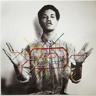
I have also taken inspiration from lesser known photographers such as Jose Romussi (14) who works largely with collage and stitching as a way to alter an image after it has been taken.  This form of physical photography interested me so I decided to incorporate it into shoot 5 where I aimed to recreate the effect of the prosthetics in the other shoots on separate portraits through the use of sewing (15) and collage (16) amongst other methods.  

(14)


(15)


(16)


This idea was interesting to me as it allowed me to explore my style in a more hands on approach and I was able to take more time forming the symbolism for each of the idioms as I did not have to worry about the model in the same way that I had been concerned when I was doing the effect makeup.

A great deal of my still life inspiration came from Brooke Di Donato (17) and the way that she was able to use flowers in her work in unusual ways whilst still maintaining a serious tone in her images.  I also liked the way that she had performed shoots both in and outside of the studio a this allowed me an opportunity to explore shoots on location opposed to being solely studio based for the duration of my project.  A difference between my work and Di Donato's is that I aimed to use flowers to form a direct symbolic link and for that reason used specific flowers in my shoots such a roses to symbolise love and lillies to symbolise death.

(17)


The future 
In the future I would like to continue further exploring ties between language and photography as well as other forms of media.  I would also be interested in further exploring possibilities surrounding effects makeup in photography for example perhaps branching into prosthetics for use in fashion and editorial styles opposed to simply convey a set idea or concept as was displayed through the idioms series.  I would also like to further explore still life photography as that is an area that I touched on throughout my project but was not able to explore to a full extent due to my limited time frame.  I believe that I will likely continue to perform studio shoots as I feel that studio based shoots created the most successful outcomes however I would like to explore ways to execute my concepts outside of the studio in order to develop my abilities further.  Unfortunately throughout this project process I felt that for the majority of my shoots this was not a suitable location to shoot as I wished to keep the viewers focus on the subject in order to more effectively allow for the message of the idiom to be conveyed.  In order to create this element of focus I decided that a more plain background would be useful.

Conclusion 
I have found throughout my time creating both of these series of images that planning is vital when holding shoots based around creating abstract visual narratives due to the fact that there are so many variables such as finding models, creating the makeup looks which were based on my idioms, booking studio space and creating lighting set ups that will best convey the narrative of the image.  This was particularly challenging as I have never attempted to organise a series of shoots which each take so much preparation prior to the shoot before this series.  Despite the struggles that were created with these series of images I feel that it effectively displayed my statement at the essays start "An investigation into the way that Surrealist Photography can be tied to Language" as I have discovered that language is present in any image through it's connotations however I aimed to amplify this effect by using traditional literary symbolism and common phrases in my shoots to strengthen the link further.


Project Image Bank

Image bank introduction 
Whilst conducting research for my image bank it became apparent that the area which I wished to explore in this series of shoots (the way that language is tied to photography) was something not explicitly documented by many photographers making research for this project extremely difficult.  As a result of this I have researched the genre of surrealism as a whole as it is this dark and subnormal genre that I want to focus on in my idiom based photoshoots.  I felt that focusing on the surreal for this reason would allow me to assess popular conventions of the genre as well as explore ways I could experiment around it through the use of physical mediums.

1.


This image appeals to me as only the subjects head and hands are visible for the purpose of applying her makeup.  This conveys the idea that women's only purpose is to be beautiful with the purpose of appeasing out patriarchal society.  The image is surreal due to the fact that only the models head and hands are visible creating a composition similar to mounted head of an animal killed on a hunting trip and kept as a trophy.

2.


This image is an advertorial poster for American Horror Story: Hotel I like the image due to the way in which the key has been placed in the subjects mouth and the subjects face has been altered in photoshop.  I find the use of the key particularly important as I wish to explore how similar effects can be achieved using prosthetic makeup techniques in order to convey the themes of idioms.

3.


This image interests me due to the way that the images lighting creates an almost otherworldly appearance for the model due to the high levels of tonal contrast which gives her a more skeletal appearance.  The costuming of the model also adds to this as the white outfit and pale skin of the model create a further element of contrast with the plain back background of the image.

4.


This image appeals to me due to the tonal contrast present between the dark black and navy tones of the image when compared to the bright white and pastel pinks present in the subjects outfit and the flowers in the image.  I also like the way that the subject has had an image of flowers overlaid over their face as it adds a sense of ambiguity to the image which draws the viewer in.

5.


This image appeals to me due to the use of coloured gels and what appears to be light trails in the image as the provide an interesting mixture of colours and tones which create a very eye catching photo.  I also think that the varying colours used in the image as well as the bright lighting creates an interesting sense of depth to the image.

6.


This image appeals to me due to the way that the dark colouration throughout the image creates a sinister edge to the image.  The contrast of tone between the models pale skin and the dark background gives the image a striking appearance which draws the viewers eye to the image.  The viewer is also drawn to the image a s result of the bold red tones used.  The models sharp features as well as the red tones of the models costume and makeup give the image a harsh appearance and carry connotations of violence however the red also carries connotations of sexuality this suggests that the image may symbolise the way that female sexuality can be used as a weapon and reference femme fatale characters.

7.


This image appeals to me due to the way that the subject is making direct eye contact with the camera and therefore the audience this combined with the angle of the subjects head and the dark colour scheme of the image gives the it an unsettling feel.  The subjects costume is a reference to tribal wear and this carries connotations of violence.

8.


I like this image because of the way that the complimentary colours of pale pink and turquoise have been used to create a high sense of contrast.  I also feel that the placement of the flowers in the image is significant as they are placed on around the female models body and flowers and a symbol of female fertility throughout many media texts.  The pink of the flowers also carries connotations of femininity.

9.


This image interests me due to the way that pink has been used throughout the image as the subject is female and pink is a traditionally feminine colour.  I also like the way that black has been used in effect similar to that of war paint due to the fact that this adds an element of danger and violence to the image as well as ideas of female empowerment.

10.


This image interests me due to the way that the subjects lack of clothing creates a sense of vulnerability which is amplified by there posing and positioning with their head in a jar.  The jar in the image gives it a dark and experimental appearance with the yellow tones throughout creating an illusion of sickness and death.  There is a string element of tonal contrast throughout the image which is largely created by the shadowing formed from targeted lighting.

11.


This image interests me due to the way that popular culture figures and texts have been combined with surrealist portraiture in order to make a striking image series.  I like the way that editing software has been used to give the image a more intense and unrealistic appearance.

12.


This image appeals to me because of the way that there is a strong tonal contrast in the original black and white photo but a further element of contrast has been added through the use of physical manipulation by painting butterflies onto the print.  This addition makes the image far more eye catching and makes the image more interesting to the viewer.

13.


This image appeals to me due to the way that projections have been used in order to create a pattern across the subjects body and colour has been added to the image through the same method giving the image a pastel range of tone.  I am also interested in the way that the artist has chosen to add the image of the eye before taking the photo as this is different method for altering an image through the collage style.

14.


I find this image interesting due to the way in which the artist has used computer manipulation to alter the appearance of the image opposed to using physical collage techniques in the style of Hannah Hoch.  I also like the way that the colours stand out against the grey background of the image and add to the abstract style of the collage.  The use of flowers in the image subvert traditional views of masculinity as flowers are generally associated with women.

15.


The depth of field used in this image appeals to me as it draws the viewers eye to the subject of the image.  I find the symbolism of the crown interesting as it carries connotations of royalty which can be subverted by the use of the tinfoil to create the crown but carries connotations of childhood.  The dark tones in the image exterior also draws the viewers eye to the subject as the subject is pale by contrast.

16.


I like this image due to the way in which pink tones have been used largely throughout the image in order to highlight the femininity of the subject.  The use of blue in the image is particualry striking as it is a complimentary colour to pink which creates an interesting element of contrast in the image.  The saturation of the image makes it extremely eye catching and plays on Andy Warhol's use of bright colours which is important in reference to the shoots name "Candy Warhol".  The use of the lollipops is symbolic as girls are generally associated with sweet things which can be referenced in the nursery rhyme "sugar and spice and all things nice that's what little girls are made of".

17.


This images lack of saturation and white tones appeal to me as it shows the perceived innocence and purity of femininity.  This can be contrasted however through the use of flowers in the image which can related to female sexuality.  I like the way that depth of field has been used in this image as it draws the viewers eye to the focus of the image which is the subjects legs and the flowers.

18.


This image interests me due to the way that it has been composed physically from various smaller images as well as a sheet of text.  I also find the images composition interesting particulary the way that the compositions is not symmetrical but instead uneven this gives the composition a more realistic feel.  I also like the way that despite the colour scheme not being bold there is still an element of one present through the use of blue tones in each image.

19.


This image appeals to me because of the way that the photographer has used paint to create an interesting tonal range within the image as well as creating an illusion of negative space as a result of the high levels of contrast present throughout.  This interests me as it shows that an image does not have to saturated and bright for it to be striking and engaging to the viewer.

20.


The day that staging has been used in this image interests me particularly the way that the subject and the bell jar are all that is visible to the viewer as a result of the use of a dark background and targeted lighting.  This effect has been enhanced in photoshop in order to make it appear as if the subjects head has been decapitated and placed in a jar.  This idea of a woman's head being placed in a jar follows the idea that women are objects to be controlled by men.

21.


I like this image because of the colour scheme used as they create a very cool tone throughout the image.  This helps to create a sombre tone throughout the image which when combined with the low saturation of the image creates a deathlike appearance of the subject.  This idea of death throughout the image is amplified by the subjects hair and makeup which is styled in a gothic way reminiscent of horror story brides.

22.


This image interests me due to the way that there is a strong red tone present throughout the image with the blood on the mug, the subjects dress, the bullet whole and the subjects lips a;; having a red tone as wells the persons shirt in the newspaper article.  These areas of colour make the image more dynamic and engaging to the viewer working to draw them in.

23.


The way that props and makeup have been used in this image to create a character is really striking and works to engage the audience.  The use of reds and purples suggests connotations of violence and passion with darker undertones being created in the image with the use of animal skulls black contact lends and tribal face paint.

24.


This image appeals to me due to the fact that I like the pastel tones featured throughout the image.  I also like the way that innocence and beauty of the flowers can be contrasted with the way the fact that shoes toed around a telephone line generally link towards drugs being sold in an area.

25.


This image appeals to me due to way that the bright tones of the flowers in the models hair are similar to the tone of her eyes and as a result pull the image together for the viewer.  I also like the way that the white background used enables for the viewers full attention to be directed towards the models opposed to distracting the eye with other image components.

26.


This image appeals to me due to the way that it incorporates standard portraiture with fx makeup in order to create a surreal image.  I am aiming to further explore this field of photography so this image is particularly important to me.  I also like the muted tones throughout the image as I feel that they provide the image with a more sinister edge.

27.


This picture appeals to me as it shows a connection between two humans through the merging of their faces with flowers.  I also like the way that the flowers are the only element of the image which is in saturated colour opposed to the more monotone colours of the rest of the image.  The overall cool tone of the image also intrigues me as does the androgynous appearance of the models.

28.


I like this image because of the fact that the snakes in the models hair carry connotations of Medusa from Greek Mythology.  I also like the way that the models blue eyes and the blue background contrast with the orange tones of the snakes.  The cool tones in the image also interest me.

29.


This image appeals to me due to the way that the artist has chosen to implement embroidery in the image after it had been printed.  This style of physical photography interests me and I would like to explore it further in my project.  The unsaturated colour scheme adds to the ghostly appearance of the subject which is heightened by the smudged appearance of the image.

30.


The faded effect around the image gives the photo a blurred appearance which draws the viewers eye to the subjects face in the images centre.  The black and white tones add to the blurred effect and shadows create an interesting tonal balance.